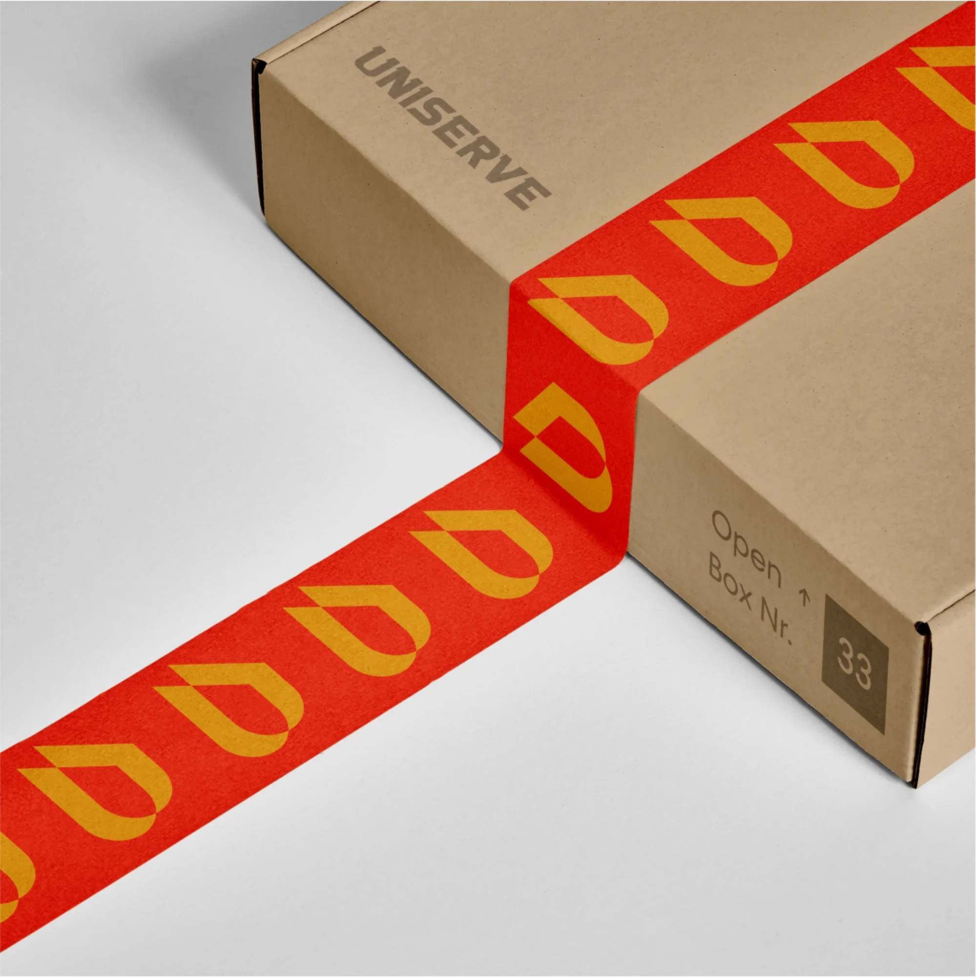
The logo mark features a sharp spiked arrow which represents the tireless commitment of the brand to deliver in good time. It also represents the forward-moving and innovative philosophy of the brand. The sharp spike is the willingness of the brand to go out of its way to ensure clients have a smooth and pleasurable brand experience.


Tolagrafik Inc.
Address
- 15/16, Alh. Obelawo Shopping Complex, Ejigbo Road, Agbowo, Iwo, Osun State, Nigeria
